
LlamaIndex
Brand Guidelines
Guidelines for representing the LlamaIndex brand with clarity and consistency
Download brand assetsBrand Name
“LlamaIndex” is always written as a single word with a capital “L” and “I.” It serves as the brand name for both our company and product (not “LlamaIndex app” or variations).
When referencing specific features or releases, please capitalize them as proper nouns (e.g., “LlamaIndexCloud”).
Logo
LlamaIndex
The LlamaIndex logo features a gradient llama icon in a rounded square with "LlamaIndex" in clean sans-serif typography. The rainbow gradient reflects our broad appeal across developer and enterprise audiences, while the bold typeface conveys technical professionalism.
Use the LlamaIndex wordmark whenever space allows, as it carries stronger brand recognition. For tight layouts or logo-only displays, the LlamaIndex logomark is a concise way to refer to LlamaIndex. Use with good judgment for your audience.
Ensure ample space around all LlamaIndex assets to maintain clarity and impact. Whether scaling up or down, allow them to breathe—avoid making them feel cramped or cluttered.
LlamaCloud, Workflows, and LlamaIndex
LlamaCloud, Workflows, and LlamaIndex wordmarks should be used whenever referring to the specific LlamaIndex products. You can find the dark variants and logomarks files in the brand assets pack.
Colors
Solid colors
The LlamaIndex color palette blends professional blues and purples for enterprise clients with vibrant oranges and pinks for developers, complemented by neutral shades that provide balance and versatility.
Off white
Light grey
Black
Dark grey
Vibrant blue
Light blue
Vibrant purple
Mid purple
Light purple
Vibrant pink
Light pink
Vibrant orange
Mid orange
Light orange
Vibrant yellow
Light yellow
Gradients
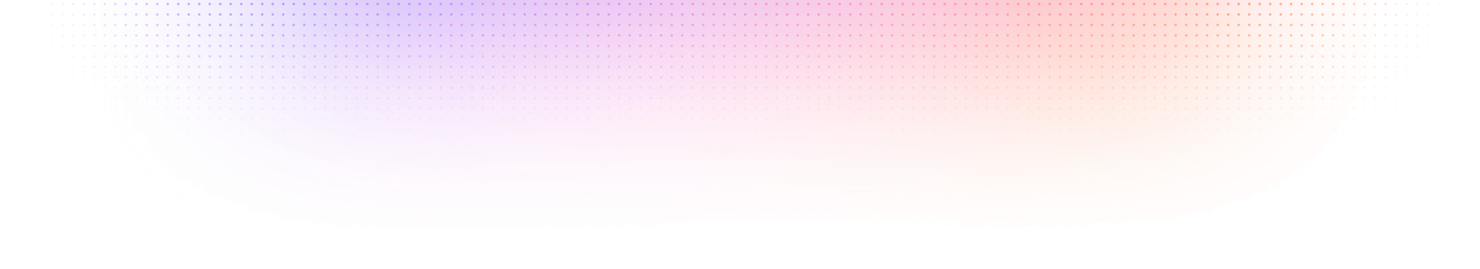
The LlamaIndex gradient system reflects our dual audience approach. The General Gradient seamlessly blends the Enterprise Gradient (blue to purple) with the Dev Gradient (pink to orange), creating a unified visual identity that bridges professional reliability with developer creativity and innovation.
Enterprise Gradient
Dev Gradient
general Background gradient
general Stroke gradient
Typography
LlamaIndex typography centers on Overused Grotesk, a clean and precise typeface that reflects our focus on clarity and technical precision. Overused Grotesk Medium serves as our headline font, while Overused Grotesk Regular handles body text to ensure readability and consistency across all communications. IBM Plex Mono complements the system as our monospace font, adding a sharp, technical edge that reinforces LlamaIndex's forward-thinking, engineering-driven identity.
Brand design & guidelines by tonik